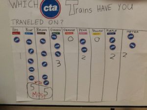
Graphing the CTA
 I live in the Windy City. We in Chicago love the CTA. Most of us use it pretty regularly. I spend quite a bit of time at child care centers in the center of the downtown area where the children arrive each day on one of the many trains that pass through the area.
I saw this graph at one of those programs and I really like the way it was completed. First, the teacher clearly did some pretty good research and planning in order to get the CTA stickers. The children then chose the trains they have been on and using the stickers they represented those experiences.
Suggestions for improvement – I would encourage the teachers to make a grid so the spaces are evenly spaced, and I would probably use a yardstick so all of my lines were straight and even (I think we should strive for neatness and precision in our work with children). I might rewrite the question on the top so it doesn’t end in an adverb (that is just a pet peeve of mine). I would write the color word in the color itself as a way for children to have another opportunity to read the word.
Orange Red Blue Green Pink Yellow Brown Purple
I like that the teacher wrote the total number in each column. The graph is clear and easy to read. It is meaningful to city kids who travel on public transportation.