Graphing – The Good, The Bad, and the Ugly
Today I want to show you three examples of graphs made with children. The first is an example of good practice – with one suggestion for improvement.
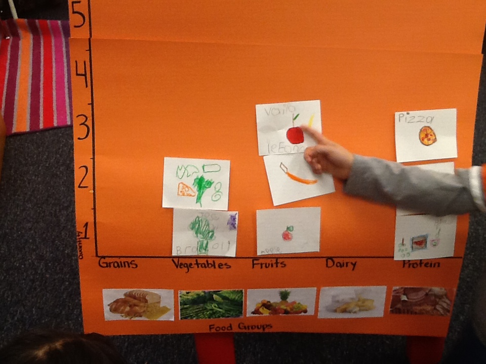 In this first example, children voted for their favorite foods by drawing a picture of the food and writing its name. The graph is simple and easy to understand. It meets my criteria for good graphing practice because it:
1. Creates a data set that can be evaluated and revisited later.
2. It provides easy visual clues that quantify the numbers of choices that can easily be interpreted by children.
3. The children can see who chose what food so those choices can be explored further.
My only suggestion for improvement would be to create a grid on the board so that each space is evenly distributed. Otherwise, you run the risk of children gluing their choices down with variable spaces between. This can cause confusion for the children who are still puzzled by appearances. You want your graph to be clear.
This next one is not so good, for a variety of reasons.  At first glance, this might look like the others I have presented but once I describe the process you should see where the problems are.
The children were asked to vote for their favorite color – simple enough, right? The teacher labeled the graph well with the words supported with an example of each color. That’s where the good stuff ends.
The children were then asked to come up to the board and vote for their favorite color using a small manipulative to represent their choice. The basket was filled with dinosaurs and cars and animals. The children didn’t really struggle with making their choices, you can see that from the chart but….
1. The graph cannot be revisited. When moved, all of the small plastic objects fell off.
2. There is no way to know who voted for each color.
3. The confusion is multiplied because the small objects were also colorful. Many of the children wanted to choose an object that was their favorite color, but it didn’t make sense to them that their object and their choice didn’t match. This didn’t make sense to any of the children in the group.
4. The objects are variable in size and were placed in uneven spaces on the board. Again, I would encourage you to always make a grid with even spacing for the children.
And now let’s look at the not-good-at-all.
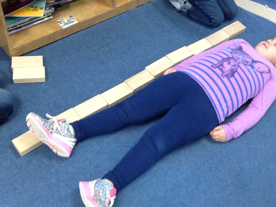 This activity was great. The children measured one another using the nonstandard unit of blocks. I loved this part.
Here, the teacher has neglected to create a clear graph for the children to “read”. It is language-based, doesn’t provide visual clues to understanding the data, and is altogether useless. The children can’t really revisit it or make meaning out of the data.
This could be used to create another, more appropriate graph, but that gets away from the whole primary purpose of the activity.
Graphs should be made with and for the children. Using the ideas from above, when graphing with your children be sure to consider how they can make meaning from the data collected and then provide many useful and developmentally appropriate clues to support their understandings.
This went well with the data collection and analysis module we completed in INCCRRA.
These are all fun ways to help children visualize graphs.
Visualizing graphs really helps children understand
I enjoy using graphs with my class!
When I was a teacher in a classroom I used graphing all the time in many different age groups and I always enjoy seeing the light bulb come on when a child grasps the concepts. I definitely used a lot of trial and error of which graphs worked for each group. I feel this is the simplest way to represent number sense and encourage my staff to use it often.